Study for Impressionistic color
Acrylic on paper
©2013 Lucinda Howe
Have you seen the Impressionism from Monet to Matisse exhibit at the Columbia Museum of Art? The exhibit presents a broad overview of Impressionism and Post-impressionism from the Dixon Gallery and Gardens. If you haven’t seen it yet, you have a few more days until it closes on April 21st.
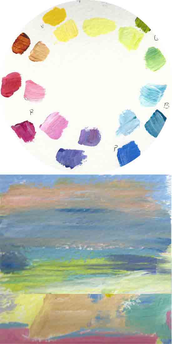
My favorite piece from the exhibit is Berthe Morisot’s Peasant Girl Among Tulips. I love the color harmony and the way the shapes of the tulips echo the shapes of the girl’s dress and hair. The colors give the impression of spring by staying with pure light colors and tints of darker colors and having very few dark values. Complements placed next to each other in similar values create visual vibration. The color chart above shows the types of pure colors and tints that would create this type of mood. I often experiment with colors this way to understand how the color scheme works, then use it later with my own images.
If you would like to learn more about how the Impressionsists painted, you are invited to bring your art supplies and paint in Boyd Plaza in front of the Columbia Museum of Art with About Face this Saturday April 20th between 9:00 a.m. and noon. There will be a costumed model as well as the Columbia cityscape for inspiration. If you don’t want to paint, just come and watch.
Have you seen the exhibit? What is your favorite piece? Would you like to try your hand at painting like one of the Impressionist masters? See you Saturday!