I hope you have enjoyed the holidays with family as much as I have.
Along with everything else going on in December, I had the good fortune to make a quick trip to Chicago and was able to spend an afternoon in the Art Institute of Chicago visiting some of my favorite Impressionist and Post Impressionist works.
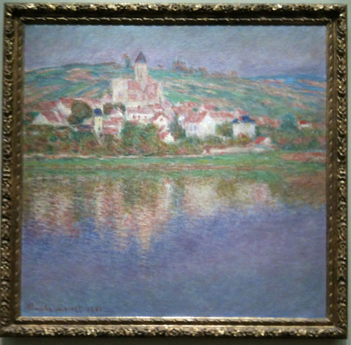
The description of Monet’s Vétheuil, 1901, included the comment, “As he did for numerous works, beginning with canvases for the series Mornings on the Seine…, he used a nearly square canvas, so that the decorative effect takes precedence over the details of the scene itself.”
I’ve been taught that the horizontal format typically used for a landscape painting is serene while a vertical format is dynamic. The square is supposed to be stable and balanced. But I had never considered that using a square format removes the meaning normally associated with the format. However, I do use a square format for my waterlily paintings, and I’m experimenting with using it for other subjects. I’m also paying more attention to how the format affects the meaning of the work.
Do you believe the format of a painting affects its meaning? Do you use a square format? If so, what type of subject works well with a square format?