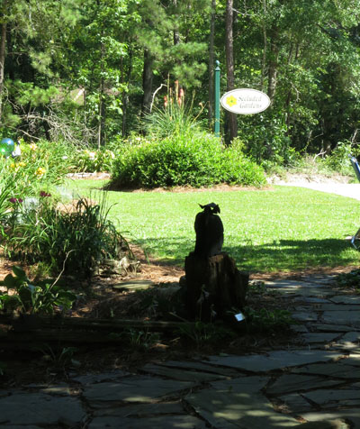
This past Saturday the plein air group painted in a private garden in Lexington, South Carolina. The garden features extensive flower beds and grass paths, an old barn, and whimsical sculptures. Surrounding trees create a feeling of seclusion. Day lilies and other perennials were in full bloom. It was all beautiful and quite overwhelming.
After a stroll around the property with my camera, I found a place in the shade and selected a support. I decided to use a 14×11” piece of watercolor paper with a purple underpainting to contrast with the yellow green that was the dominant color in the landscape. To simplify the details in the plants, I planned to use value layers to separate the dark shady foreground from the light flower beds in the middle ground with a middle value representing the tall trees in the background. I painted two hours until critique time at noon.

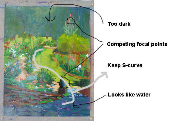
One of the best things about painting with this group is the critique. The discussion is informal and everyone participates (sometimes all talking at once), and I always learn a lot. Comments from the group were that the dark foreground looks like water. The s-curve of the path was working as a design element leading to the focal point in the upper right. Unfortunately that wasn’t where I intended the focal point to be. I could see I had some more work to do.

Back in the studio the next day, I considered revisions. The acrylic paint was dry, so I could paint over it. Too much of the space was occupied by the dark and middle values top and bottom and the middle value was too dark and solid, so I decided to crop the painting to 12×9” with a utility knife.
I intended for the dark sculpture in the lower right to be the focal point, so I eliminated the red flowers in the upper right. I also made the dark area look like stepping stones instead of water, and strengthened the s-curve without losing the value structure. I added some lighter value and texture to the background and made some minor adjustments in the flowers to establish the direction of the light from the right.
At this point, I feel it’s closer to my original intention, but I’ll let it rest a few days before I decide if it’s ready to sign. What do you think? Is it finished?

Sandra Dryden
19 Jun 2012I like all the revisions you made to the forground and middle ground. The whitish vegitation at the top of the path seems to be a block to the “S” curve movement you set up. The value of the area above the path is good but I would like a little more definition of lights and darks to give some depth so I could feel I can enter this area as well.
I have been enjoying all of your posts very much. Sandra
lucindahowe
19 Jun 2012Hi, Sandra. Thanks for your comments. After looking at it so long, it’s helpful to have another person’s viewpoint.
Rich
19 Jun 2012Looks good to me.