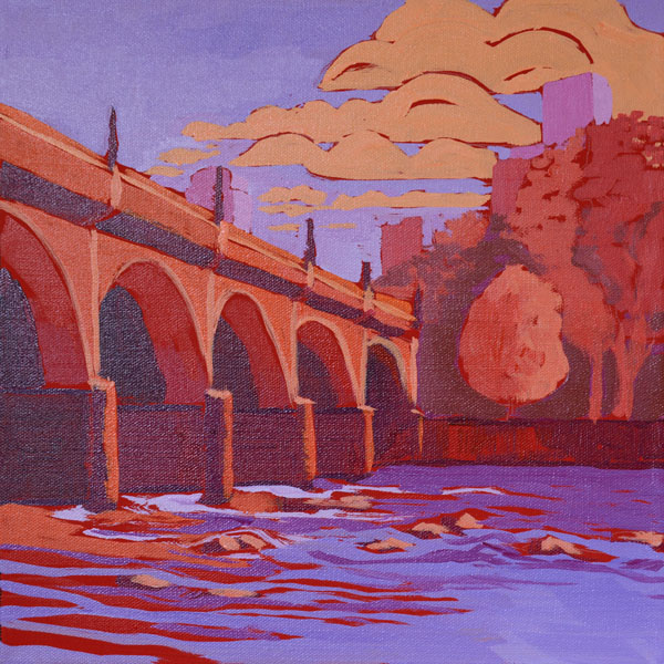
12×12″
Acrylic on gallery wrap canvas
©2016 Lucinda Howe
NFS
In this next painting in the bridge series, I decided to experiment with expanding the red hues that I used in last week’s piece to an analogous color range of purple-red-orange. The overall effect is warm, but the range of colors allows for contrast of cool and warm tones in the clouds and sky and in the structure of the bridge. I used less intense colors and middle values for the trees to make them seem further away. Adding white to the purple made it read as a cooler color, leaning toward blue when placed next to the red in the river and light orange in the clouds.
The colors in this painting make me think of the glow of sunset. There is less value contrast than in last week’s piece, so it has a quieter feel.
I feel that this was a good experiment with an analogous color scheme, but as a general rule, I like the energy of contrasting complementary colors and values, so I’ll most likely do more of that in future pieces.