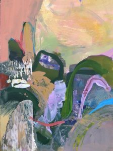
7.5 x 5.5 inches
Larry Moore introduced the workshop on Abstraction in this way, “This is a class about personal discovery. If I teach a process for creating in my voice, I am dismissing yours. My objective is to give you a way of seeing, thinking and creating that is 100% you.”
In the first two days of the workshop, we started with small and medium size studies. It was surprising how hard it was to think of exploring an abstract idea instead of developing an image. I focused on making a variety of shapes and textures in my pieces. But I left class at the end of the second day unsure of where to go next. I didn’t sleep well that night and woke up in the middle of the night thinking “I need more value contrast!”
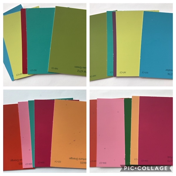
In the next two days, I expanded my small studies to a larger canvas and aimed for more value contrast. When Larry demonstrated, he did a lot of color mixing and graying colors. He didn’t use colors right out of the tube, but instead built varied color with layers. As we talked about developing our own color sense, Larry suggested visiting the paint store next door and choosing a few color chips that we liked. I collected a few and played with some combinations in class.
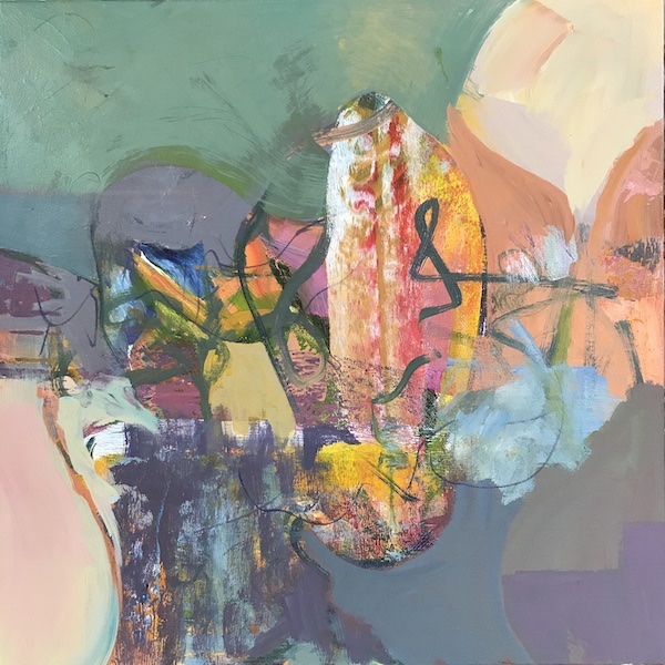
With Larry’s guidance, I completed a 24×24” painting, but I was not totally satisfied with the colors.
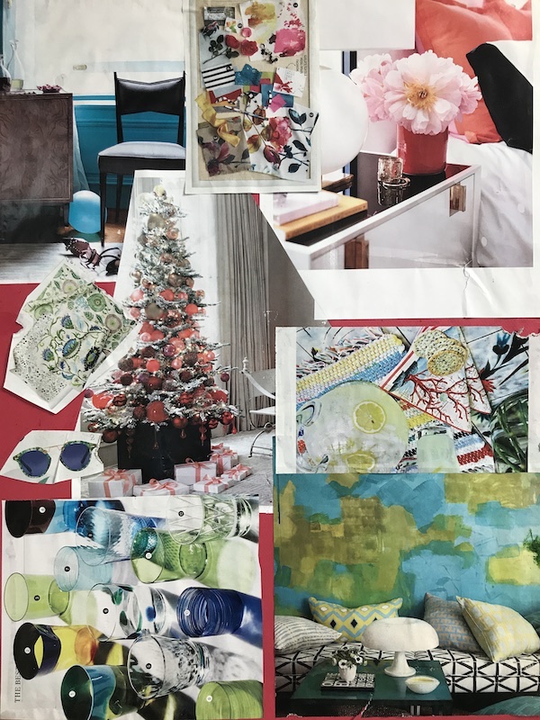
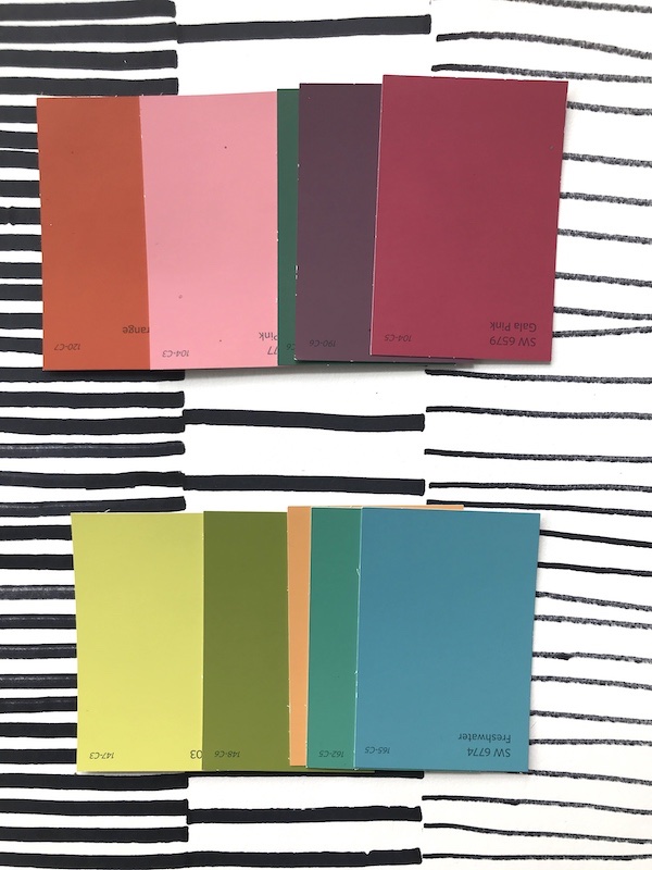
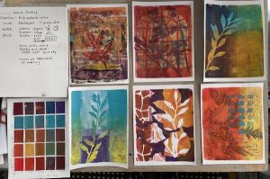
Back in the studio, I’ve been playing with the paint chips combined in different proportions and with a collage of favorite colors. I realized I like somewhat more saturated colors combined with black and white. As I thought in the middle of the night, “I need value contrast!”. I already knew this from my attraction to Fauvism, but hadn’t stated it as part of my intent in working abstractly.
As this is part of the process of discovery, I’m making notes about what I’m finding. I’m looking forward to more discoveries as I practice more exercises from the class.
Jean Bourque
14 Dec 2019I love the way you explain your class and the processes it inspired in you. One of my professors stated this past semester: that all art is abstract in its essence, as none of it is real. If we seek to represent something from the real world in representational art, even though it may look like the item; it is an abstraction because it is only 2d and not 3d like the real item. If compared to literature or scientific writing an abstract is a summary of the entire book or paper. He takes it one step further by saying all art is non-representational. As an artist that typically paints non-representational abstract art, that gave me much to consider. I had never been one to explain my art, instead I would allow the viewer to tell me what they see. However, another professor informed me it was hard for people to get meaning from my art if they had no direction to go with it. (especially if none of it represented anything to them) Thus the art statement is developed on what the art is about, to provide that direction. Often abstract art (for me, anyway) is about exploring an emotional issue, a health issue, an ethical question or just playing with color. Using the art statement to explain the theme of the art and the exploration within, gives the viewer more clarity as to what the artist is exploring. The perfect final semester for a BFA graduate was being able to bring images to life and to state clearly what they are about in a final art show. To sum that up, IMO abstract art expresses the intangible, things that are literally non-existent as a tangible item.
lucindahowe
16 Dec 2019You make some good points. I agree that the art statement gives the viewer an entry point into the artist’s thinking. Artists like to think our work speaks for itself, but the combination of word and image gives more clarity.