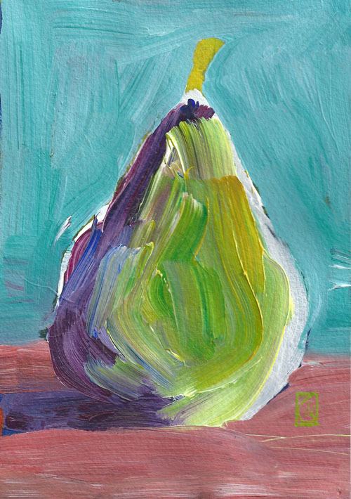
7×5″
Acrylic on paper
©2013 Lucinda Howe
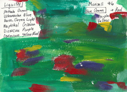
Discords purple and yellow
©2013 Lucinda Howe
Would you like to know more about how colors interact with each other? Do you want to know how to avoid making “mud” when you mix colors? Do you want to refine your own sense of color and be able to describe it to other people? Do you have a favorite color that appears in much of your work?
In the next few weeks, I will be starting a new series on color theory based on the Munsell color system. Click here to see the Munsell color wheel and learn how it is organized.
Because the terms used to describe color are often confusing and imprecise, the Munsell system focuses on three characteristics to describe color… hue, value, and chroma.
- Hue is the name name we usually associate with colors such as red or blue-green.
- Value is how light or dark the color is.
- Chroma is the purity or intensity of color. In general, paints right out of the tube have the highest chroma, and mixed colors have lower the chroma.
My favorite way to use color is high intensity complements (opposites on the color wheel) with bits of other colors as accents . My blue-green color chart above is based on colors directly from the tube. However, you can also develop a less intense color scheme using the same colors. The pear is an example of using the blue-green and red color scheme as a lower intensity. Although I’ve labeled it turquoise and rose, a more accurate description would be
- Turquoise = light value, medium intensity blue-green
- Rose = light value, medium intensity red
What do you think about describing color in terms of value, chroma, and hue? Does that make sense to you? Try it out by describing your favorite color in the comments below.