Banks of the Congaree #1
12×12 inches
Acrylic on gallery wrap canvas
©2016 Lucinda Howe
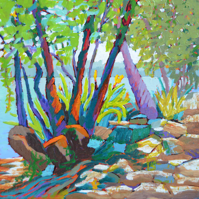
In the design world, colorways are different color combinations using the same pattern. You see it often in wallpaper and tiles. For a simplified example, think of a checkerboard pattern of light and dark squares. A traditional colorway is black and white. Different colorways might combine yellow and purple or pink and dark green. Even though the colors change, the pattern is still recognizable.
The same concept applies to painting. If you maintain light and dark relationships, you can use any colors you like.
In my series of paintings of the Gervais Street Bridge and surrounding areas, I selected this grove of trees along the west bank of the Congaree River to experiment with colorways. The dark silhouettes of the trees and the dappled sunlight on the rocks form a strong contrast of light and dark. This first colorway uses the vibration of complementary blue and orange colors against cool blues receding the background. The mood is cool and cheerful. Next week, I’ll change the colors to create a completely different mood.