Sunny Days
Another delivery of fresh seasonal flowers from Boone Fox Farm is the inspiration for this week's painting. I decided to get out my acrylic paints this time and start a…
Another delivery of fresh seasonal flowers from Boone Fox Farm is the inspiration for this week's painting. I decided to get out my acrylic paints this time and start a…
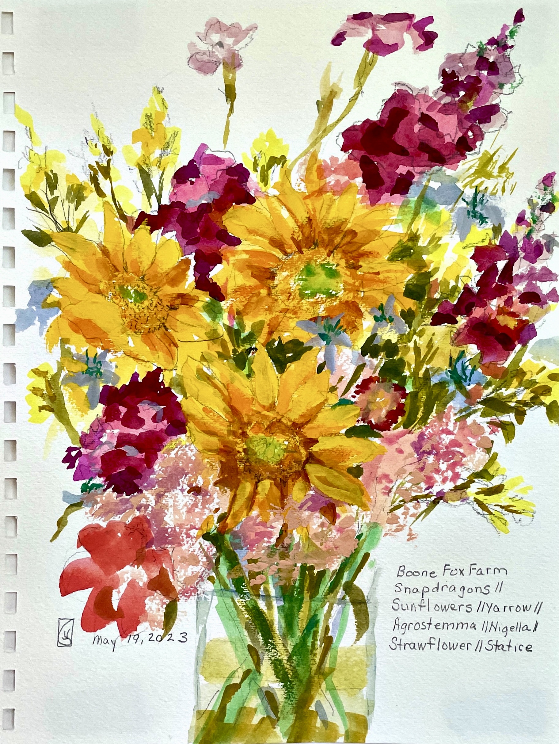
This week's flower delivery had more intense colors than the earlier ones. The bouquet made a wonderful subject for painting with a range of light to dark values and airy…
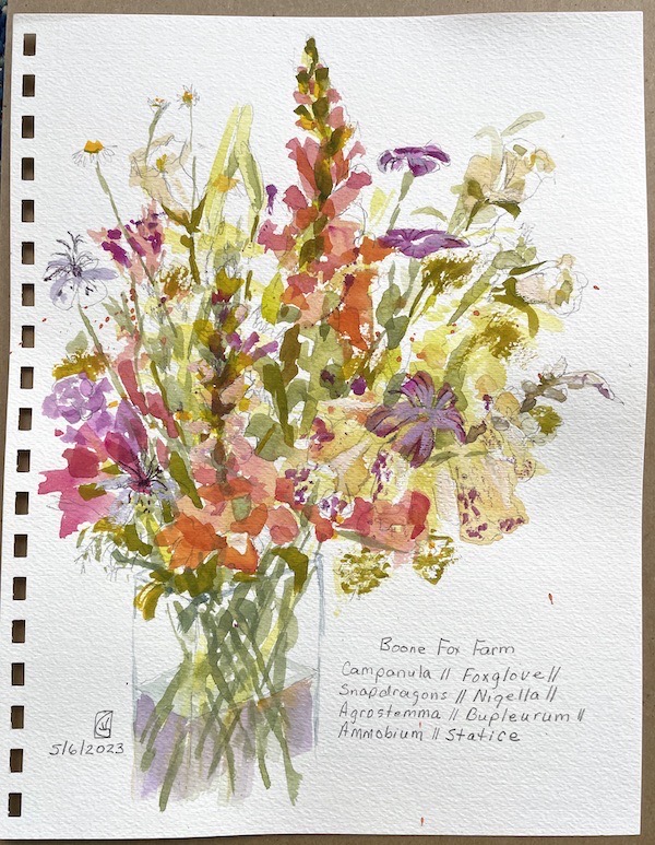
This week brought another flower delivery from Boone Fox Farm. I took the bouquet to my Wednesday paint group and started a light pencil drawing on a watercolor journal page.…
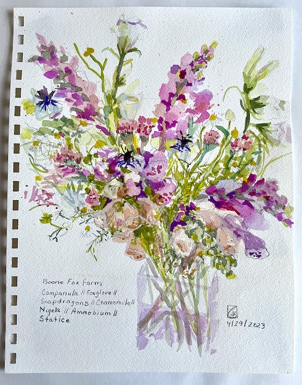
I've been looking forward to the new spring season of flower deliveries from a local flower farm, Boone Fox Farm. The first bouquet of delicate peach and purple flowers arrived…
Last week I went on an Artist Date to the Richland County Library, Main branch, in downtown Columbia, SC. An Artist Date is a concept I learned years ago…
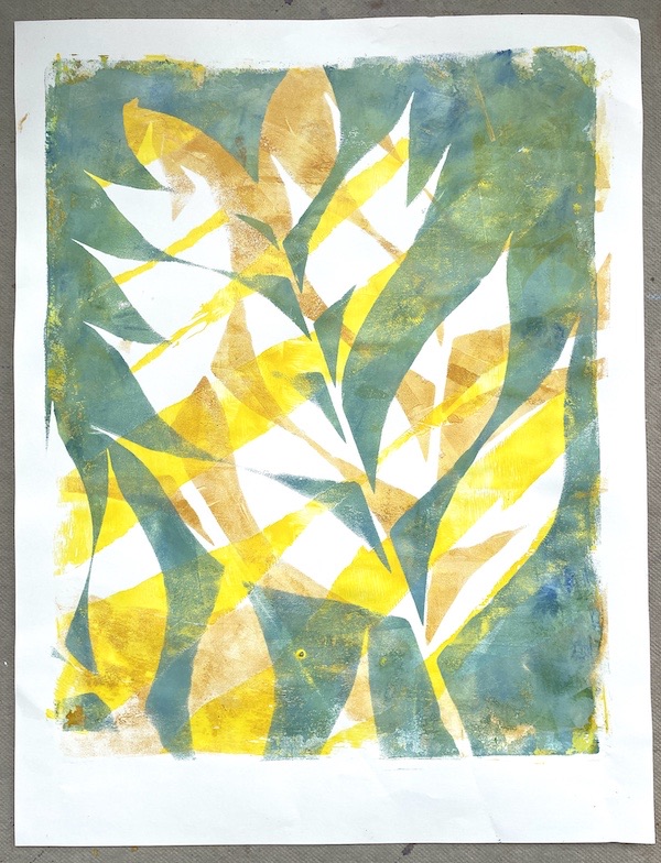
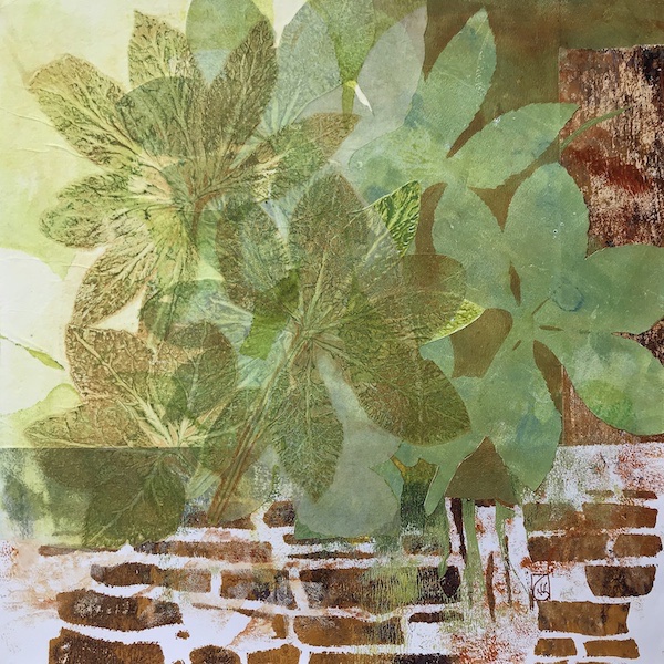
This week I was inspired to do some gelli plate printing with palm branches that I brought home from Palm Sunday service at church. I had done something similar two…
Last week I was telling you about how I work an exercise from an art technique book in my visual journal when I need inspiration. Somehow, I wrote the blog…
Sometimes when I want to start a blank journal page, I refer to my library of art books. Most have exercises to teach art concepts and inspire creative thinking. This…
If you are thinking of starting a visual journal, you may find that it’s hard to know where to start. You may feel that a blank page is intimidating. You…
In recent discussions about art practice, I’ve heard several friends say some version of “I want to feel more creative”, “I wish I were more creative”, “I’m not as creative…