Have you noticed that you always gravitate toward certain colors in your home or wardrobe?
Do you wonder where to start when building a harmonious color scheme for an art project?
Would you like a more precise vocabulary for describing and mixing colors?
In this series of 4 posts, I will describe ways to identify and use your personal color palette. These exercises are aimed at collecting or creating art, but can also be used to develop a color palette for your wardrobe or home décor.
Over the years, people have been challenged by how to describe color. Clothing and paint manufacturers raid the thesaurus to come up with names like “live wire” and “confetti”. I doubt even Merlin could imagine his namesake color.
In the early part of the 20th century, a painter and art teacher, Albert H. Munsell, developed a system for naming color. He said that color has three characteristics; hue, value, and chroma. Hue is the color name such as red or green. Value is how light or dark it is. Chroma (also called intensity) describes the purity of the color. In general, paint straight out of the tube has the highest chroma. However, there are exceptions. For example, Hansa yellow has higher chroma than yellow ochre. The intensity scale moves from pure color toward neutral gray. All colors can be described using a combination of these terms. For example, “live wire” is a light-medium value, high chroma, yellow-orange. And Merlin, bless his heart, is a medium-dark value, medium intensity violet. Are you getting a better picture? Being able to describe colors in this way is a good starting point for mixing colors and talking about it with others.
In part 2, I’ll talk more about the Munsell color system and how to use it.
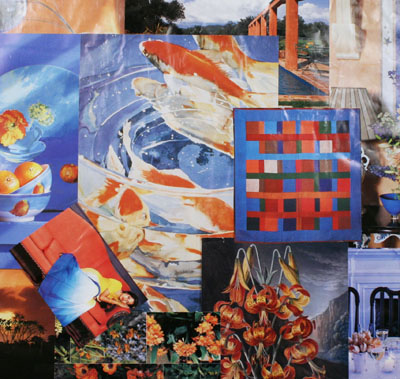
In the meantime, start collecting color samples that appeal to you from magazines, personal photos, favorite objects, and natural elements. Don’t be concerned about the images; just concentrate on color and try to identify what you like. Later we’ll identify common themes in your collection and build a collage of your personal palette. At the top of the post is an example of one of my favorites, a high intensity complementary palette of blue and orange, but yours will likely be very different.
Read the other parts of the series..
Part 2: Developing Your Palette Using the Munsell Color Wheel
Leroka
1 May 2022Hey, Lucinda! I have a book of color combinations from Sanzo Wada (japanese artist). Called “Dictionary of color combinations”, I don’t know if it’s still on sale (it’s pretty old). He wasn’t focusing on contrast or complementaries to create beautiful palettes. The primary aim was to convey the message and meaning; he was not concerned about creating contrast at all costs. I’m in love with his combos. There is an interactive version of those colors – https://coda.io/@hexpot/interactive-dictionary-of-color-combinations
But nothing really goes into comparison with the printed version