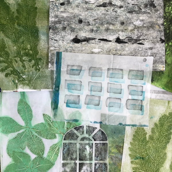
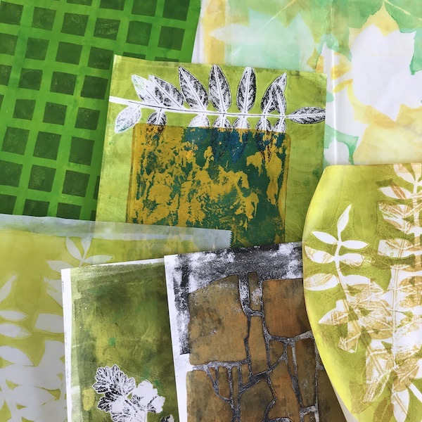
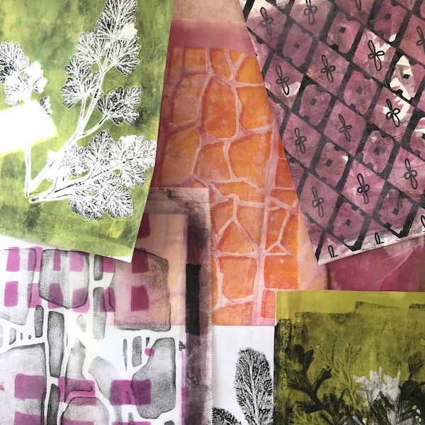
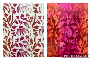
Spring continues to burst into bloom in South Carolina. This week, I’ve made a few leaf prints in warm greens and yellows to add to my collection of collage fodder. Thinking about what to make next, I’ve gathered prints into groups. I look for the following design elements…
- Color combinations that suit the season
- Light, middle, and dark values. I like some black and white elements in addition to colors.
- Organic shapes (leaves, flowers, bark) and structural shapes (stone walls, grids, stripes)
You can help me decide which one to do next. Which of these groupings of collage papers do you like the best? Is there a piece you would eliminate? Would you emphasize one of these design elements (color, value, shapes) more than the others? Let me know what you think in the comments and I’ll consider your ideas in my next collage.

Pam
14 Apr 2020I love #2. I don’t know why!
You are doing such great work with these prints.
💕Pam
lucindahowe
14 Apr 2020Thanks, Pam!
George
14 Apr 2020Love the Cool Greens, Cindy.
lucindahowe
14 Apr 2020Thanks, George!
Nancy Washington
14 Apr 2020Hi Cindy, I really love what you are doing with the leaves and other items from nature in your collages. I especially like the elements in no. 3.
Hope you all are staying well and safe.
Happy Spring!
Nancy
lucindahowe
14 Apr 2020Thanks, Nancy. Hope you are staying safe and well, also!
Ann Masek
15 Apr 2020I love the green and yellow, it just seems to say Spring but everything you are doing with colors and designs are very striking I picture so many of your creations as scarves I would love to wear. Thanks for sharing!
lucindahowe
15 Apr 2020Thanks, Ann.I love the idea of wearing these designs as scarves.