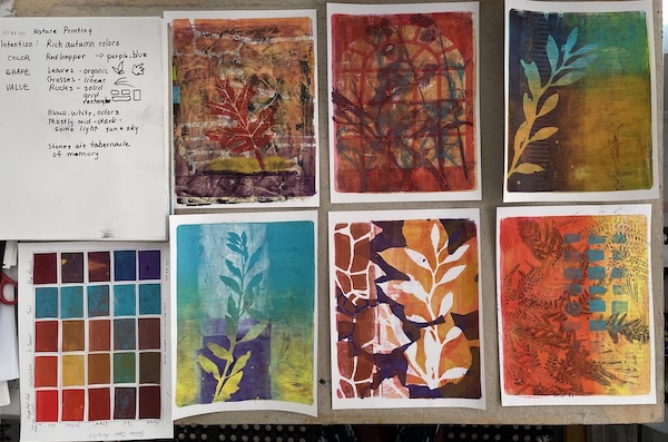
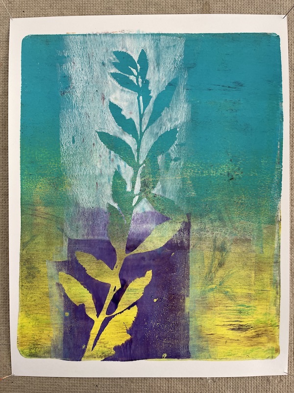
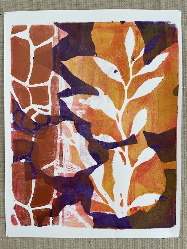
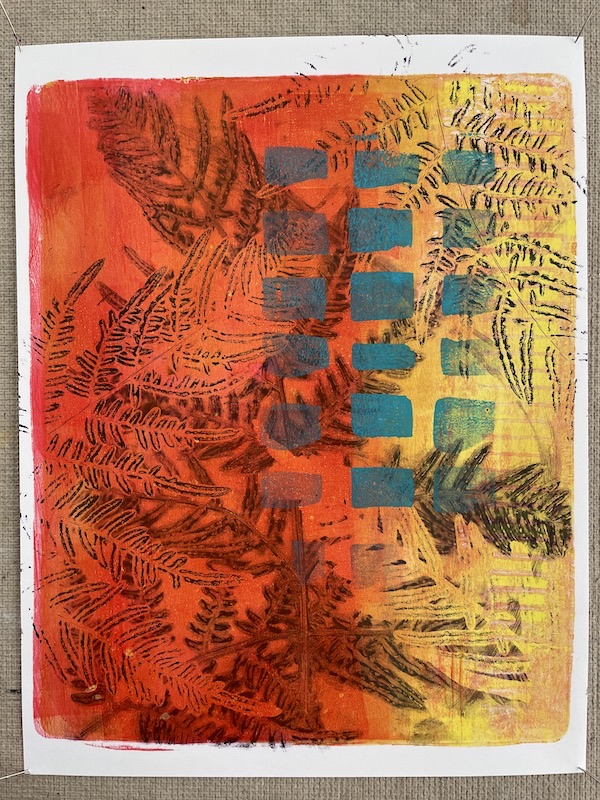
This week I’m practicing a lesson on printing in layers from A Year of Gelatin Printing with Julie Fei-Fan Balzer. I’m using a 10×8” gelatin plate and 11.8.5” white card stock. I made several color charts using different combinations of colors, and chose one that looked like autumn. The paints are Golden Open Acrylics in Naphthol Red Light, Yellow Ochre, Iridescent Copper, Teal, and Dioxazine Purple. I will also use Black and White paints.
Before I started, I set my intentions:
- COLOR: Rich warm autumn colors with touches of blue sky
- SHAPE: Leaves, grasses, rocks, garden structure
- VALUE: Full range of values, mostly middle to dark value with some lights.
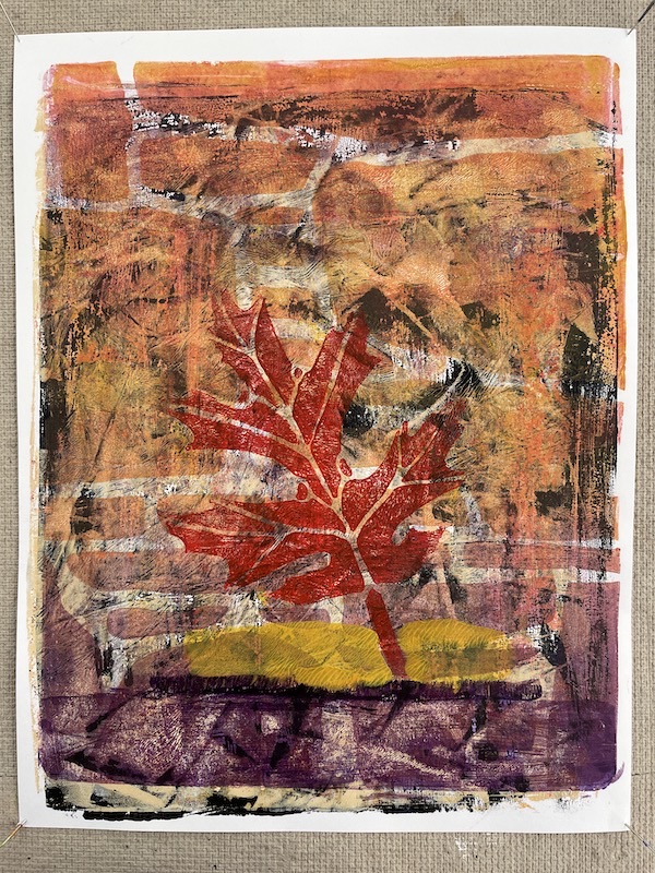
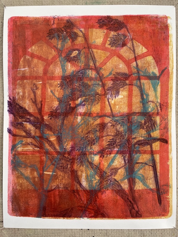
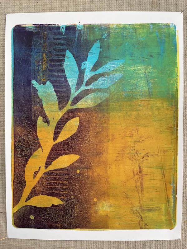
I started by printing about two dozen backgrounds, then chose several to develop further. I’d like to end up with 6 pieces in a coordinated group. As I look at this group, I’m evaluating whether these pieces fit with my intentions, how I can improve them. I’ve made notes about my thoughts on each piece right now, but I may change my ideas as I go along.
joan
29 Sep 2021So helpful to know your process, Lucinda and I love your artwork!